Teambuilding Brand
North America TeamBUILDING Branding
Internal Ideo Project
All project content has been altered to comply with IDEO privacy agreements
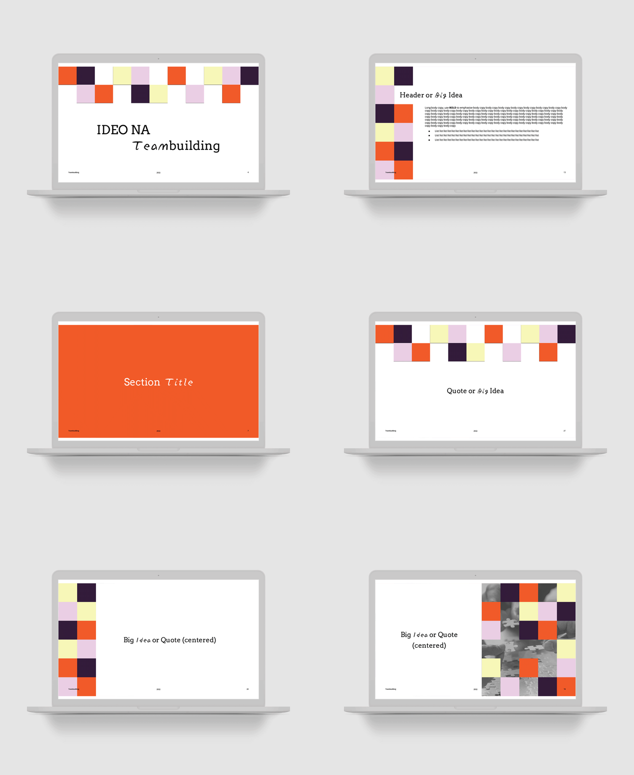
Teambuilding came to me with a project proposal to brand the North America team so that when they made announcements about procedure updates, or reminders, or Slack messages, or put out an email newsletter, it didn’t get lost in overwhelming everyday communications. They wanted a visual language that was easily recognizable so that people would know how to focus in taking in the information, and easily being able to distinguish this as a Teambuilding announcement versus any other kind of announcement.
The design is straightforward using black and white imagery, associated with connecting dots, putting the pieces together, and helping people come together to form a project team (the role of Teambuilding). A four color palette is easily recognizable, bright, and bold. The typography hopes to convey that Teambuilding truly is a team effort, combining both handwriting and Serif typefaces.


